
|
Brand Board
This was the first project I did for my branding. Thus, I was still exploring the choices I had to make for my brand. I envisioned the brand as a candy business, because I really like candy. Since I created the brand as a teenager who liked candy, I wanted to make it so that my brand came off as fun and lively to fit the candy theme, but not childish. I intended the brand to be candy for all ages. When I first began to design the brand board, I looked on Adobe Color to find an image with the colors that fit my brand. Originally, I chose the 5 reds and blues pictured in the brand board for the contrast in warm and cool colors and their resemblance to candy. I then searched the internet for suitable fonts and images for my brand board. After assembling them, I added a 6th color, the tan, because I realized that I was lacking a neutral tone to balance out the palette. I also made a small pattern with shapes that can be seen at the top next to the name. I believe it resembles pieces of candy and adds a little variation to the board. |

|
Logo/Stickers
In development for my logo, I first sketched out my drafts in my sketchbook. I wanted to incorporate candy into the logo, and I envisioned that the text of the logo would cut into the candy and leave crumbs. The first sticker was my first attempt at a logo. However, I felt that it wasn't clean enough, and it wasn't easy to work with. Its versatility was important to me, since I needed to reuse it for my other sticker designs. Thus, I remade it into a cleaner, more symmetrical design, which can be seen in the other stickers. I ended up choosing the 2nd design on the top line as my logo, as I thought it was balanced and simple. For my other sticker designs, I reused the main candy design for most of them, adding in the candy "crumbs" for variation and changing fonts when needed. |
|
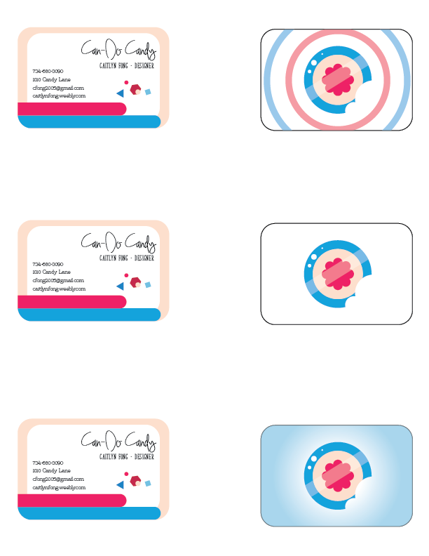
Business Cards
This assignment is probably the one that I am least satisfied with. Even so, I did my best to put thought into it. On the left is the design for the side of the card with personal information. I used the script font to write the name of the brand, as I wanted it to be the first thing that caught the reader's eye. I used left-right alignment between the names and the information to create horizontal balance, and I added the "crumbs" and border design in order to make the design more visually appealing. However, I think in doing so, I made the design feel cramped. I think maybe removing the tan border could open the space up more and make it more balanced. The right side is the other side of the card. I made three versions with slight variations on my main logo design, sans the text, all while incorporating my main color palette. My favorite is the first, since I think that the different color rings help the logo pop out at the viewer and make it feel more bubbly. |

|
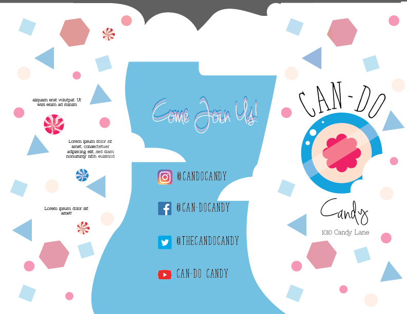
Brochure
For this assignment, I wanted to get more creative with the layout of the brochure. While researching different designs, I discovered a few brochures that incorporated unconventional shapes into their brochures themselves and not just in the designs on the brochures. I decided that I wanted to do that, so I made a small illustration of several pieces of candy. I then placed it at the top of one side of the brochure, and traced it to create a "cutout" for the brochure, which can be seen in the gray area at the top of both sides. On the other side, I considered how I could incorporate the shape into another design- I ended up making it into clouds, and placed social media information on top of the image of a sunny day. I maintained the cohesiveness in the design with the use of my candy "crumbs-" in the first image, the bottom of the design has a border of the crumbs, reminiscent of candy ropes, while the second images has the crumbs in larger patterns on the white background to create visual engagement. |

|
Packaging
This is my favorite design out of all my branding. Tying back to the brochure design, I decided to incorporate the cloud and sky motif into the main part of the design- the top of the box. I felt that the image of a sunny day with a few clouds instinctively gives the audience a pleasant impression. I especially like the layering I did with the modified logo design. It adds a pop of color to the main design and looks faintly like bubbles, adding to the feeling of fun. I also like the typography. I changed the font size to place emphasis on "bliss." I still placed my brand name on the main design, but I made it smaller, since if a consumer has the packaging design, they likely already know about my brand. I also left information about the brand on the back of the box. On the sides, I used the drawings and patterns I made in previous designs, the lollipop and others and the candy rope. I adjusted the lollipop and candies slightly and added a white border around it to let it pop a little. For the design of the box itself, I researched packaging designs and went with a basic box, designed to hold some candies, which was inspired by a box of candy I actually ordered from online. |
|
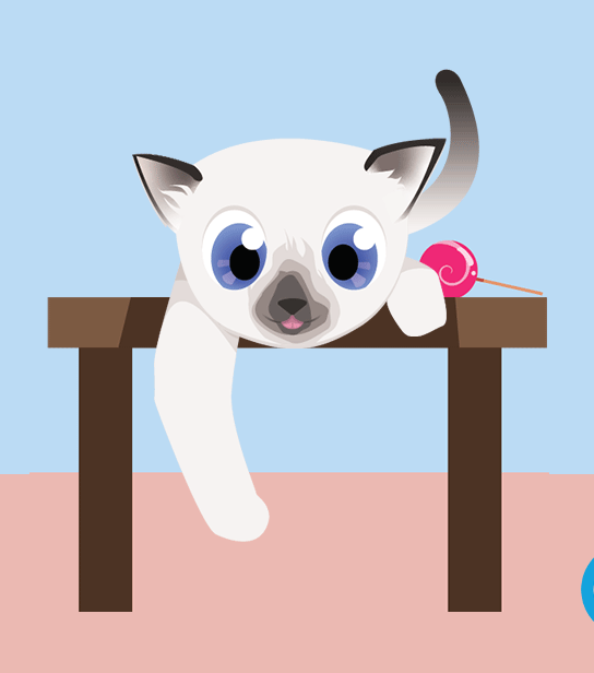
Mascot/Animation
For this animation, I used both Adobe Illustrator and Photoshop. First, I needed to decide on my mascot. I ended up choosing a cat inspired by my pet cat, Lulu, because I thought a cat is a good representation of the cute and lively atmosphere that I wanted with my brand. I also added the lollipop that I drew before, which I planned for her to carry around. I then began to draw the different assets for the animation in Illustrator. I drew each part of the cat that I would need to move and exported them separately before importing them into Photoshop. I originally intended to use Photoshop's tweening tool to assist with my animation, but then I realized that it would blur the frames for certain movements, so I ended up adjusting the animation frame by frame. In order to create the illusion of speed, such as when the cat bats at the candy, (which I used my logo for,) I used a small amount of frames over a large amount of movement. |
